Jon Falcone looks at upcoming releases that marry an excellence of sound with a love of a tactile product. Be they strange, beautiful or interesting, each release offers something worthwhile to stuff in your hands, as well as your ears. Consider it a coffee table book for your smartphone.
Milagres ‘Violent Light’ (Memphis Industries)
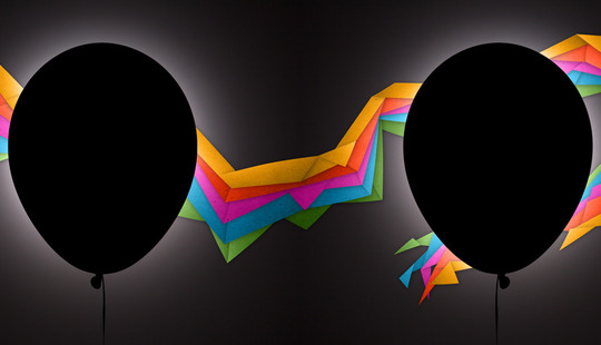
Sometimes an album comes along that thrashes styles together to create something genuinely new and is completely progressive, without being pretentious. Brooklyn combo Milagre have combined striking drum sounds, earnest croon and melodramatic ambience in their latest album ‘Violent Light’. This sound is reflected perfectly by the black on black nothing that is pierced by technicolour. DiS posed some questions to the designer Stephanie Butterworth and band member Kyle Wilson.
DiS: This cover is great, what’s the story into how you got involved with this Stephanie?
Stephanie Butterworth (SB): This is the third album artwork I have done for Milagres. They were on the hunt for someone to do the artwork for Glowing Mouth three years ago, a mutual friend thought of me and passed on a link to my work. I was really into their music so it was an easy decision to take the project on.
Kyle Wilson (KW): The band wanted something stark and iconic. We'd come to realize that our album cover was going to be experienced as a tiny little thumbnail on a computer screen most of the time and we wanted to make sure that we had something that would be instantly recognizable in that format. We loved Stephanie's work on the other albums and we knew she could help us realize and improve upon our ideas.
DiS – I get a real sense of a modern prog rock album form this image, which I also, in some respects get from the music for being experimental, but not in a stereotypical long-haired self-indulgent way at all. In some ways for me though the image shares compositional traits with ‘Dark Side Of The Moon’. What’s your take on the image?
SB: I can't say it was intentional!
KW: Yeah, personally as we were working on the artwork I was thinking of the images more from an emotional standpoint rather than a stylistic one. However, I will say that as a band we are often re-contextualizing musical ideas that we love from the past – trying to make sure they sound fresh and extraordinary rather than re-hashed.
Some of the images that I brought to Stephanie to describe the feelings I wanted the album art to evoke were from my childhood. There is this great children’s book called “Arrow to the Sun” which I’ve always loved.
DiS – To self-indulge myself, prog style, a bit more, I always think of prog covers as predominantly having some kind of abstraction or re-appropriation of context to reflect the intent of the music. Are you trying to 'shift' perception of the music with this image and if so, how?
SB: I wouldn't say I was trying to shift perception with this image. The cover image is derived from the lyric “floating in a black balloon into the aurora” from the track The Letterbomb. The band had come to me with the idea of a black balloon on a black background. They had a photographer friend, Peter Siskos, shoot the balloon and then pass it onto me to take it from there. The idea of a rainbow or a series of retro feeling colour blocks also came from the band. We wanted it to have a rudimentary feeling about it, like paper cut outs. I like to think of the arrangement of shapes as an origami representation of the aurora borealis.
‘Unused cover version for vinyl, working title ‘Black Balloon’’
KW: In order to get Peter to photograph the balloons I actually had to ride across the Brooklyn Bridge with them on my bicycle. One of them was a three foot balloon which wouldn’t even fit in a cab. It was the only way I could figure out how to make the shoot happen. It was quite the spectacle, actually. Tourists were pointing and taking pictures.
‘Inside sleeve, CD’
DiS: In ‘Violent Light’, especially lyrically, there's lots of romanticism, from euphoria to despair and in the balloon shape, again, there's a slight hint at the delicacy in this album. Predominantly though, this is a bold image, are you trying to strike any balance with the emotional in this image or is it purely design
SB: I have to say the balance between the suggested delicacy of the balloon and the bold shapes surrounding it was unintentional. The image as a whole is strong and visually explosive, with bold colours and a sense of intrigue created by the radiating light behind the balloon. By contrast the foldable paper shapes and the floating balloon create a feeling of lightness and suspension in space. This frozen moment speaks to the dark and dreamy character of the music.
KW: I think that intention was there more in the initial phase of conceptualizing the idea for the cover, though it was pretty intuitive. My band mate Chris had described some of the songs as being "dark, but with a tiny core of light," which made sense to all of us. Initially we worried that our idea might be treading too close to, as mentioned earlier, Dark Side of the Moon territory, but ultimately we decided we could embrace that comparison if it came since there are subtle musical allusions there as well.
DiS - Finally, could you take me through the process of how you put this image together?
SB: The cover art was a collaboration between the band, the photographer Peter Siskos and myself. The band had a vague idea of what they wanted... to try photographing a black balloon on a black background with the addition of graphic elements. Peter tried a variety of balloon shots and I ended up using one where the backlight was directly behind the balloon, giving off an even dispersion of light around the balloons edge. This shot gave the suggestion of the balloon while keeping a sense of drama and mystery.
There were several iterations of graphic elements that all took on the shapes of cut and folded paper in various colourful arrangements. It was important that the shapes have a fluid relationship with each other while also feeling like they are part of the same world as the balloon. I drew the shapes in Photoshop and played with their arrangement. The paper rainbow goes from front to back and across both panels on the inside cover. A paper texture was applied to the shapes to give them a tactile quality. The sharp edges of the rectangles and triangles were softened with slight curves and bends. Many layers of light and shadows on each individual shape were the finishing touches, bringing the image to life.
‘Violent Light’ is out on Feb 24th on Memphis Industries
Death Vessels, ‘Island Intervals’ (Sub Pop)
‘Death Vessel, ‘Island Interval’ front cover
Neo-folk artist Death Vessel’s wondering pop is an album of wondering, beautiful escapism. This simple yearning is captured beautifully on the cover, and Alec Thibodeau, the artist involved in this fine piece is the brother of Death Vessel’s centre point, Joel Thibodeau.
DiS – Is this image a rendering of somewhere real?
Alec Thibodeau: The image contains features from real locations, but I've arranged them together using unreal proximity and scale.
The idea for it all started with an excursion to hear the album's music in progress. Most of the recording for ‘Island Intervals’ happened at the studio of Alex Somers in Reykjavík, Iceland. My honey and I visited Joel during the middle of his time working there. Alex was gracious, showing us around the city and playing us initial mixes of the songs. We rented a car and took a day trip to see the hot springs at Geysir (where the English word "geyser" gets its name). The country's interior looks like another planet. It's bare, craggy and beautiful... strewn with pools of volcanically heated water which periodically erupt into the sky.
When the recording work was done I listened to the finished songs over and over again, triggering new visions in my mind, which blended with my memories of the visit. After Joel told me the album's title, we discussed a cover concept based on large shapes, rather than on detailed drawings, which is my usual visual style.
The land masses in the image represent the album's creative locales across several nations. On the left is the USA's Rhode Island, where Joel lives and where he conceived most of the initial song ideas. At right is the general vicinity of Reykjavík. Pete Donnelly, who recorded Joel's last record, was back again this time as part of the group of American and Icelandic musicians who played in the studio. Concurrent with this work in Iceland, Samuli Kosminen recorded his own percussion parts in Suomenlinna, an island region of Helsinki, Finland. Suomenlinna's Iso Mustasaari land mass appears at lower left, nestled up against Rhode Island's Block Island.
After settling on the location shapes, I resized, shuffled and rotated them into an arrangement that looked harmonious. What I like about the image is how the central, lighter blue area resembles a cresting wave.
‘Island Intervals’, production photo, perimeter lines in ink’
DiS – What I also like is that there's no detail to it, a useless map that looks great. What do you think the image says about the music?
AT: While I appreciate your interpretation of the image as a unified whole, I wouldn't agree there's no detail to it, or that the map is "useless." Maybe "nonlinear" would be a better descriptor.
The design's function reminds me of when Joel and I were kids and we shared a bedroom that had wallpaper featuring a map of the USA's North Eastern coastline. The wallpaper was already there when our family had moved into the house, and the design it reproduced was old, maybe from the 1800s or possibly from the British colonial era. This being wallpaper, the pattern repeated every few feet. The map wasn't totally useless, since it contained recognizable areas. But as a visual reference its utility became absurd through repetition of the same information.
I think of the ‘Island Intervals’ cover this way. While derived from real maps, it becomes an imagined place through recombination. As for details, if you look closely you'll notice faint silhouettes of tumbling astronauts scattered throughout, as if the figures are falling from space and casting shadows on the ground. I've also filtered the entire composition through a photograph of roughly textured bookbinding paper, which has a course surface and dried leaves inlaid into it. The photographic element adds texture to the land masses, making some areas look to me like the surface of the moon.
When I listen to the album I hear themes of water and outer space in Joel's lyrics. The island shapes, water forms, astronauts, lunar texture and overall cool palette of colours are my attempt to visually convey these water and space themes. Also, my process of layering the visual information for this project somewhat replicates Alex's production style, in which he records numerous tracks of instruments and vocals to create lush sonic landscapes.
‘‘Island Intervals’ production photo, astronaut illustration in pencil’
DiS – What do you think Joel is documenting with his songs? In some ways music
could be seen as a useless map to people's emotions and experiences because they can never be truly shared. Would you say there's anything to that statement?
AT: Joel is a songwriter with tremendous empathy for others. He's documenting stories, often with someone else as the subject, be it a person he knows in life or a character from literature or his own imagination. So when he sings "I" or "me" he's not necessarily referring to himself (although sometimes he is). And no matter how poetic his lyrics become, there's a narrative thread running through them. He definitely doesn't choose words lightly.
Again, I would respectfully take issue with the term "useless" here. And I would also disagree with your statement that emotions and experiences can't be shared. Yes, it can be difficult to connect with other people. But this is one of the reasons why art exists. When dry explanation fails us, artistic expression steps in. It locates and bridges the universals of human existence, even if its exact mechanisms remain inscrutable
All humans know joy, longing, sadness, insight and euphoria. We are social animals, and we naturally seek to share these experiences with others. And as receivers of sensory information, we can't help but seek rhythms, patterns, harmonies and meaning in the world around us. So while individual contexts might not translate from one person to the next, emotions and experiences can at least be approximated through music.
Even with a close examination of Death Vessel lyrics, it might be difficult for a listener to figure out the literal story, or stories, which inspire any one song. But the facts here are unimportant. What matters is the story's drama, weight or poignancy -- any or all of which Joel uses to craft emotionally relatable music. To paraphrase Vincent van Gogh, "Ignore the obvious and exaggerate the essential."
_ ‘Island Intervals’ production photo, select constellation illustrations in pencil’_
DiS – How did you get into visual design and art?
AT: I've been drawing since as far back as I can remember, with art and music always linked together for me. I have memories of being two or three years old, playing with our parents' vinyl record collection which included a lot of albums from the 1960s. Robert Crumb's cover for Big Brother and the Holding Company's Cheap Thrills was one of my favourites. I would lie on the carpet and just gaze into the little vignettes. These scenes endlessly captivated me, because they were simultaneously exquisite and unsettling. The cyclops man - with his long hair, halo, cigarette and bare chest -- seemed like a creepy version of the blonde Jesus from my illustrated Bible for children.
Much later I found Crumb's other work and learned that his Cheap Thrills art was originally intended for the album's back cover. Janis Joplin insisted it be moved to the front because Crumb was a friend of the band, and she was a fan of his work. As I grew up listening to more music, I discovered this same spirit of informal collaboration in other bands employing their friends to make album covers: Andy Warhol's banana for the first Velvet Underground release, Raymond Pettibon's drawings for The Minutemen and Black Flag (his brother's band), Maura Jasper's illustrations for Dinosaur Jr.
And since my teenage years I've been a huge fan of Sub Pop. In addition to the excellent music, I've loved the label's integrated sense of design, starting with that unambiguous logo and those now-iconic black and white Charles Peterson photographs. Jesse LeDoux's Grammy-nominated work for Chutes Too Narrow marked a different style, but it felt like a natural diversification of the label's aesthetic quality.
Sub Pop's people have been a dream to work with on the Death Vessel albums. They've always trusted the creative decisions Joel and I have made. We finished the ‘Island Intervals’ cover not long before Sub Pop unveiled it as an accompaniment to ‘Ilsa Drown’. We handed over something to them that we'd toiled on by ourselves, and then they just turned around and released it to the world. No interference. No micromanaging. They're selective about the artists they choose to work with, but then they step back and put incredible faith in those artists. It's refreshing.
'Death Vessel’s merchandise designs’
DiS – So your involvement with your brother’s work is logical enough..
AT: Short answer: Rank nepotism. Longer answer: I've worked with Death Vessel since the band's beginnings, making illustrations for previous album covers and designing show posters, as well as merchandise like patches and buttons. I believe strongly in Joel's music. Plus, he and I have similar styles of working. So it's a good arrangement all around.
DiS – So how did you bring the textures and the images together?
AT: Okay. In a nutshell, the image went from a digital phase to a physical phase and finally back to a digital phase again. Digital Phase One: First I collected the image's geographic locations from online maps. I cropped, resized and arranged these using design software, reduced them to thin perimeter outlines, then printed the outlines onto office paper.
Physical Phase: Using a dark pencil I traced and transferred the outlines onto illustration board, simplifying them as needed. I also drew a little dot to represent the tiny, one-house island of Clingstone, just off Jamestown, Rhode Island, where Joel and I attended a Fourth of July party last summer. I inked these pencil lines with a nib pen, which I routinely dipped into a bottle of heavy, black ink. During this phase I separately drew the astronaut forms and a set of illustrations to resemble night time sky constellations, one for each of the album's eight songs. These began as sketchbook drawings before taking their eventual form in black ink. Photographing the bookbinding paper with a digital camera was the final step before production went back into the computer.
Digital Phase Two: I scanned all the ink drawings, imported the photography, then digitally composited everything with the same design software from Digital Phase One. For the cover I filled the map shapes with colour tones, and merged this result with the bookbinding paper texture. Using a digital drawing tablet and stylus I painted in additional shading and accent colours; subtle pinks, yellows and greens to complement the overall blue scheme. Later on I sampled these colours when constructing the lettering for the band name and album title. The constellation illustrations ended up in the interior layout, accompanied by star forms I digitally created.
All this work happened with routine input from Joel. His good eye for visual design came in handy several times. For example, my original colouring had a paler, baby blue hue. Joel suggested we try different variations, pushing the image into greener hues, with less contrast and darker tones. Having worked on the paler version alone, I was initially hesitant to make this change. It just seemed too "minty" to me. But looking at it now, I can barely detect any green. It feels just right.
‘Island Intervals’ is out on February 24th via Sub Pop, all images used with kind permission from Alec Thibodeau.
Father Murphy, ‘Pain Is On Our Side Now’ (Boring Machines)
‘Father Murphy, ‘Pain Is On Our Side Now’, front cover’
Italian musicians Father Murphy make strange, beautiful, eccentric music that sits between the Residents and The Microphones. They’ve long held strong visual partnerships, including with American artists Vinh Ngo, who designs their album covers. It was great to have an opportunity to discuss this architecture of bones with Vinh.
DiS – You’ve collaborated with Father Murphy for a while now, what keeps the partnership going and have collaborated with the band for a long time now, what does your art say about their music?
Vinh Ngo (VN): Initially, it was their take on psychedelia that really drew me in. Throw in a bit of folk, a bit of outsider and a bit of tropicalia, too. I was hooked.
The design work I do for Father Murphy is pretty collaborative and I try to incorporate aspects of the songs and the band’s perspective into the images. Looking back on our projects now, it’s nice to see how we’ve grown and changed together. We started out creating things together that seemed light in tone and got progressively heavier and purposeful with each release.
DiS – Have you always created images to accompany music?
VN: Well there definitely have been songs that saved my life. Music has always been prominent and inspired a lot of things I’ve done by hand. Sketching stuff inspired by lyrics onto letters or decorating mix tapes was pretty common for me. I also used to make tiny pillows of musicians I was into and package them up with mix tapes.
There’s not much of an art background for me, just a lot of interest in sounds and visuals. I do like to make mini-comics by hand and give them away in different ways. Leaving them on doorsteps, tying them to balloons. Years ago, I sent Father Murphy one of these mini-comics and that’s how all this trouble started!
'Branch sculpted as bone, unused image’
DiS – The band have some wonderful collaborations on their videos too, and collaboration seems to be important to them. How important is collaboration to you when making art and when working with Father Murphy?
VN: For personal projects, collaboration isn’t so important, but when I’m doing design work for others I think it’s necessary. For Father Murphy in particular, our discussions play a huge role in the development of core concepts for each release.
Before working with Father Murphy, I was working on stuff that didn’t really allow for collaboration, and I think it affected some of our first projects together. It took us a while to convey our ideas and get our points across through emails. I think things really changed when we finally met in person and spent some time together. As our friendship developed, our dialogue became more personal and our ideas became better aligned.
DiS – What role does Catholicism play in them in the artwork for 'Pain Is On Our Side Now'?
VN: It’s not so prevalent in this release as it is in others. It’s intended to be more about layers and how things are perceived through veils of sound or veils of vision.
‘Inside panel’
DiS – Does nature play in the artwork?
VN: There was a lot of discussion about the nature of senses, pain being a prominent one and how our bodies fail us. Bones seemed to surface a lot during our talks. Also, the Reverend’s (Freddie Murphy, lead singer in the band) really into trees, and after exchanging a few photos, we found an image that would tie in well with the overall feel. So, there’s a lot of biology going on in the imagery.
DiS – Would you say there's an element of horror to the band's music and do you think there's an element of horror to the artwork?
VN: There is anguish and darkness in Father Murphy’s music and maybe, to some, that can be horrific. There are also moments of beauty and calm that live alongside this darkness. I try to align the work with the music, hoping that it’s a unified experience when someone has it in their hands and is listening to the record.
The design work I do for Father Murphy generally has darker tones. It’s heavier than anything I’ve done before, but I think it’s also the most powerful and graceful imagery I’ve worked on. That’s a testament to their music.
DiS – So how did you create the images?
VN: I started with photos of x-rays and trees and used Photoshop to layer the images and play around with transparency. The idea was to create a vaguely anatomical look with a sense of both depth and obscurity.
‘Pain Is On Our Side Now’ is out now
MisterWives, ‘Reflections’ (Photo Finish/Island Records)
‘MisterWives, ‘Reflections EP’, front cover
MisterwWives are a Brooklyn trio and their newly released debut EP is a bright blast of soulful pop that sprints through a slew of styles, all underpinned by the threaded brilliance of singer Mandy Lee. With artwork by Fabian Manzano that’s as bold and the music therein, we asked Mandy and Fabian about making that first initial public statement.
DiS – Please could you tell me a bit about yourselves and how this cover came to be.
Fabian Manzano (FM): I am the owner and founder of These Quiet Sounds, a design studio and clothing line. I’ve always had a passion for art and design. I earned a Bachelor of Design in Architecture from the University Of Florida in 2006 and I’ve been in the band Boyce Avenue for over eight years. I designed our band’s first EP cover in early 2007 and haven’t looked back since. I’ve designed t-shirts, cd covers, websites, gig posters, and countless other visual assets for our band. I also work with other talented artists like Hannah Trigwell, CeCe Frey and Misterwives just to name a few.
Mandy Lee (ML): I am no way, no how, a visual artist – in contrast. I just have strong ideas as to what I would like our artwork to be, but can barely draw a stick figure. I got into making our website, show flyers, banners because when the band started out we did everything independently so I had to learn the tricks of the trade, thanks to Etienne, our drummer, who is a Photoshop wiz. The visual for our EP was inspired by the title "Reflections". The image reflects what we are, all our spirit animals coming out of a gramophone. I wanted the gramophone to look earthy with vines wrapped around it and the horn shaped as a flower, because of how organic our sound is.
FM: MisterWives and Boyce Avenue are both represented by Free Association, a Brooklyn based management company. Jonathan Pardo has been our manager since the very beginning and he is always introducing me to great new music. One day he emailed me some MisterWives tracks and I instantly fell in love. I got to see them play live in Chicago and we’ve been friends ever since. I’m glad that I got the opportunity to help out with their EP cover.
''Reflections’ initial EP cover sketch’
DiS – A debut release is always a big statement as it is the first impression set out to the world. What do you want to say with this cover as a statement about the band and the music itself?
ML: Absolutely. The animals signify what we connect to and the diamond placed on ‘my head’, the elephant's head, stems from our ring logo. MisterWives is a play off the term ‘sister wife’ which is when a man marries multiple woman and they then become friends. We reversed those roles and came up with MisterWives and the ring represents the marriage between us. Even the diamond's cuts have a hidden MW mirroring each other in the center of the diamond.
As far as the animals go, we all have our fascinations with specific ones we are most connected to. Will (bass) wanted to be a paleontologist when he was a youngster so he's loved Dino's forever. Etienne is infatuated with the number eight since the number is in his name when pronounced, he was born in OCTober, his favorite number is eight, therefore his favorite creature is an OCTopus. I've always been in love with elephants primarily because of what they represent; gentleness, compassion, love, connectedness to others, even the Ganesh who is the remover of all obstacles has the head of an elephant. Relating to what they symbolize...I also grew up with ears that never quite fit the size of my little head right, so I adopted the nickname Dumbo from my family.
Lastly there's the hummingbird which represented the band as a whole. These birds signify the enjoyment of life, which is what we are all about. It's also a bird, which birds are always affiliated with song. They are colorful, vibrant little things that seemed pretty fitting considering how much of that exists within my band mates.
FM: Mandy already had a great concept and sketch worked up so we just had to make sure that the details and colors were compelling and bold. We also did some reformatting to make sure that the title and band name fit just right.
DiS – Finally, as a pop band with a 'pop' cover, are there any pop conventions you wanted to pay homage to or incorporate, or twist?
FM: A lot of pop CD covers feature the image of the artist, for branding and marketing reasons. It’s refreshing to find a band that wants to make a unique artistic statement so we wanted to honour that visually.
‘‘Reflections’ initial sketch’
Reflections is available now.
David Lynch, ‘The Big Dream, Deluxe Edition’ (Sunday Best)
‘David Lynch, The Big Dream Deluxe Edition’, central cover image
Whilst David Lynch’s work is rightly celebrated globally, he’s as revered for his collaborations. From his allegiances with actors and actresses to working with Angelo Badalamenti, everything Lynch turns his attention too drowns in an atmosphere that is truly his own. It’s true of his own music as well, having worked with artist David Correll on the initial cover and the packaging for this deluxe extended edition. It was fascinating to get an insight into working with David Lynch.
DiS – What was your in into cover art, was David an influence on your work?
DC: I got into graphic design through music. That might sound cliché, but it’s true. I remember as a kid being fascinated with all there was to see in the record stores, and the record ads in the Sunday circulars. I memorized all the album covers — Genesis, Tom Petty, Iron Maiden, The Misfits.
By the time I was in my late teens, I was getting more focused. My interest in design as a career started with a love of the music-industry work done by Peter Saville, Vaughn Oliver and Mark Farrow. Peter Saville was the first designer I could name. Long before I knew what “graphic design” was, I was spending hours with a friend, pouring over every detail of Saville’s packaging for Joy Division and New Order.
Long before I knew about the graphic design magazine Eye, I was in a bookstore and saw a magazine on the rack with the artwork from New Order’s Republic on the cover. I grabbed it immediately. I figured, whatever this magazine was, it had something about either New Order or Peter Saville, and either way, it would be worth picking up. I think I was 20. That magazine made design a “thing” in my mind.
So that was design. David Lynch showed up in my personal life. His work was a huge influence on my personality. I still remember the first time I saw Eraserhead. I was in high school — it blew my mind. I had never seen anything so creative and mind-bending. My love of music and David Lynch films, and Kubrick, and Scorsese, and Carpenter, and Cronenberg, and Bergman, became a shibboleth as I developed friendships in my twenties. We spent night after night analyzing every little detail of this film or that film. We once had a Twin Peaks costume party. We were nerds.
DiS – Given Lynch's impact on the film and art world, working on a release like this is a huge opportunity to play a part in his cannon of work. How did you come to be involved in this project?
DC: It’s been incredible to be able to work with him - literally a dream come true. The relationship began when I did the packaging for Sacred Bones’ reissue of the Eraserhead soundtrack in 2012. Some time after that, David and his musical partner Dean Hurley approached me to work on ‘The Big Dream’. David had created the imagery used on the front and back covers of the original release and I did the rest of the packaging. David had some ideas for the whole look, and I worked with him and Dean to nail those ideas down. It’s been an honour to be able to collaborate with him, working to bring his vision to form. They’re both great people, and have been fantastic to work with.
DiS – Special editions are an interesting format and they seem to be well established now. What considerations did you have to take on board when designing an expanded package?
DC: Mostly just looking around my living room and considering the special editions that I’ve chosen to buy and display myself - the ones that have moved me. Records create a world, and the packaging is a big part of that. A special edition is a great chance to explore more of that world and expand it - and then create an artifact from that world.
DiS – Similarly with this format, how do you move the artwork away from the original and give it that sense of being 'special' or 'deluxe' without getting the tone wrong or being disrespectful to the original sleeve and the creativity behind it?
DC: When I worked on ‘The Big Dream’ I also worked with the Sacred Bones, who put the record out in North America. They do these limited editions that are silkscreened, so for that record we re-interpreted the ‘Big Dream’ artwork in two-colour art for silk-screening. That apparently worked out well, so that artwork became the basis for the deluxe edition box. We took an idea that was based on the physical constraints of silk-screening and made it the cover art.
With the rest of the packaging, we were working with the same assets we had for the original release, but also some that didn’t get used in the original. Deluxe editions are geared towards deep fans, so you have a lot more freedom. You can experiment more. So that led to dissecting the original artwork a little, for example, pulling apart the cover icon on the three included CDs.
DiS – In this edition there is also a booklet of photographs taken by Lynch, are these images the pillars from which the artwork? If so, what was your approach in re-interpreting the images? 'Lynchian' is often over-used but is it suitable here, if anywhere?
DC: His photography was key. You’re totally right that term ‘Lynchian’ is both over-used and appropriate. I definitely wanted it to feel ‘Lynchian’. There is a ‘David Lynch aesthetic’, and this needed to fit within that.
I listened to the record a lot while working on it, getting my head into the feel of the music. There’s a lot of space and mystery in the music, and his semi-abstract photography complimented that perfectly; the photography is so intriguing. Like a Lynch film, you want to figure it out. I had a lot of fun playing around with the typography of the lyrics, laying it out in ways to reflect the mania found in a lot of the lyrics.
DiS – How did you create the central image?
DC: I assume you mean the “icon” of the bolt and figure inside the triangle? That was something that David put together. I did a couple options for possible other cover layouts using that image, but we ended up going with David’s original. This look; industrial, scratchy, dirty, uncomfortable, off-kilter — informed the rest of the design. We had scans of hand written notes and lyrics that we were able to incorporate into the rest of the packaging.
The ‘glow’ effect on the type was a fun process. We went through many, many rounds figuring out the exact look we wanted. The final product involved quite a few layers often type to get the effect, mixed with scans of the handwritten lyrics. I had a lot of fun arranging the type on the page in rhythm with his singing. “Sun can’t” duplicate, nudge, nudge, nudge; “be seen” duplicate, nudge, nudge, nudge; “no more” duplicate, nudge, nudge, nudge; “Sun can’t” duplicate, nudge, nudge, nudge…
‘’The Big Dream’, full package’
The Big Dream, Deluxe Edition is available now
Read the rest of the columns in the series here.